
fresh
keeping it easy and fresh.
Team
Kristen Huang
Tools
Figma
Role
UI/UX Designer
Duration
September - October 2024
💡 EMPATHIZE + DEFINE
The story
As a student at the University of Michigan, I wanted to help improve living habits on campus. I discovered that something was happening in students’ shared spaces, especially in the pantry and fridges: fresh groceries were forgotten and lost, creating clutter and mold. Students found themselves throwing away groceries because they did not know how to use them properly to cook healthy and delicious meals.
This is how the vision of fresh started, an accessible mobile application that students can use to keep track of their groceries and discover new recipes based on what they have in their pantry and fridges.
The interviews and audience
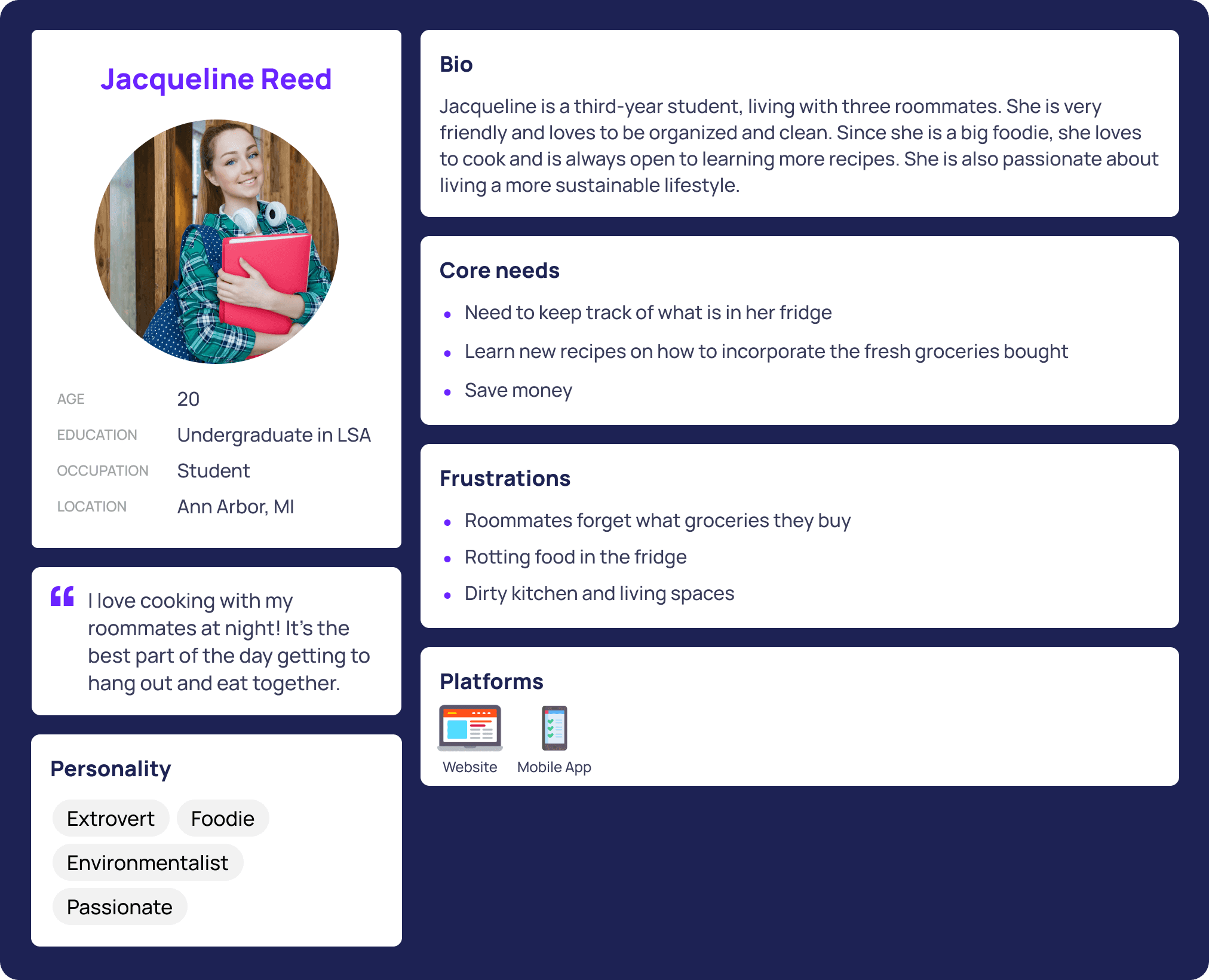
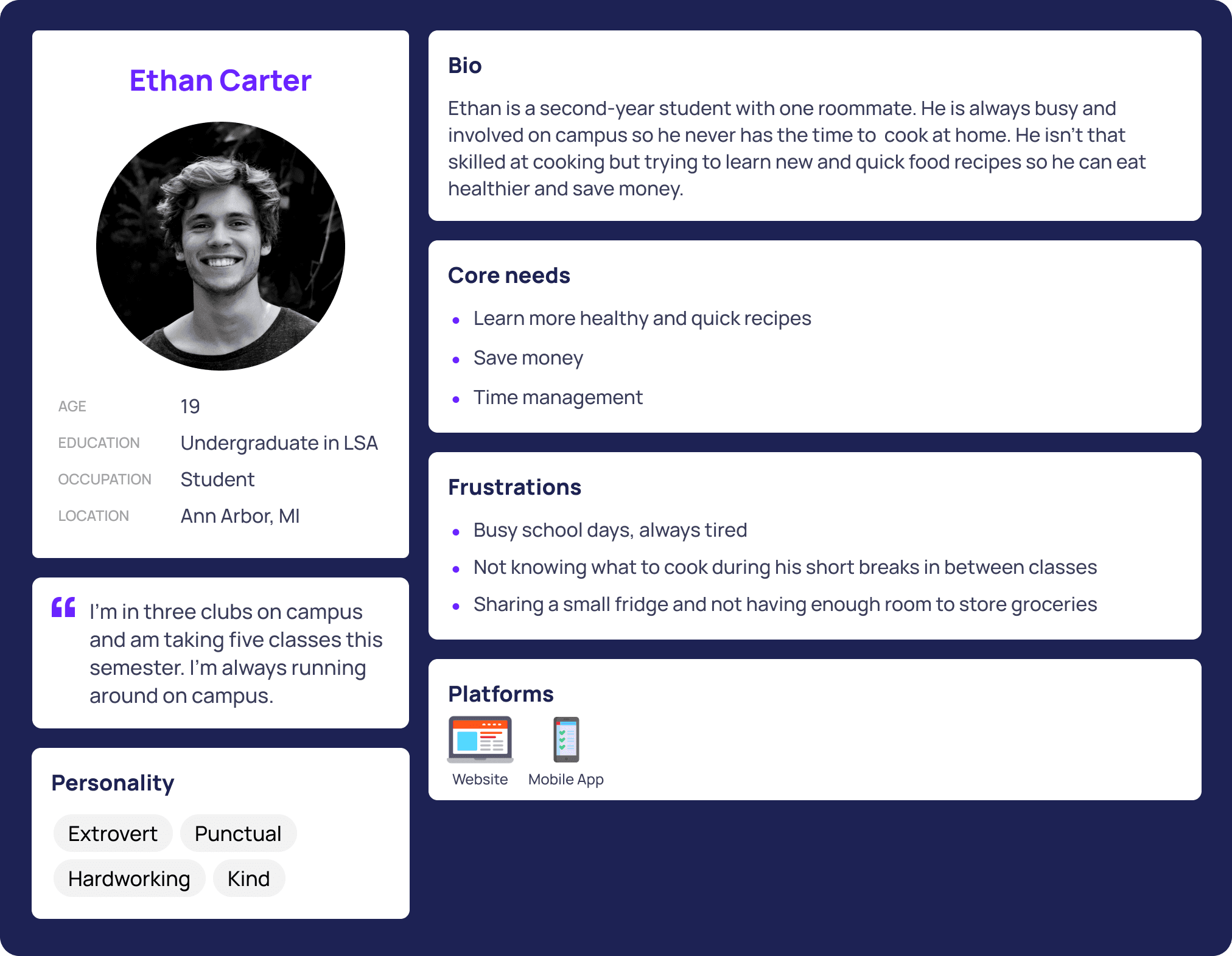
I interviewed five students at the University of Michigan and here are how some felt...


I also created some personas to help understand my users' needs, experiences, behaviors, and goals.
Final problem statement
Students want to learn quick and new recipes to manage their food in their fridges by using and keeping track of what they buy to reduce food waste.
💡 IDEATE
So… what's the vision of fresh?
Food fuels the body.
fresh is designed to create a convenient and safe social environment for those interested in finding new recipes to cook with the fresh groceries they buy. By introducing a social community on the platform, students can share their delicious meals and spread food positivity throughout campus. The grocery tracker allows students to track what they already have in their fridges and pantries, reducing food waste and clutter.
I created a sitemap and sketched some initial screens to envision the product.


Lo-fi wireframes


User testing feedback
Many participants were confused on how to click and edit items in their pantry because of the lack of instructions
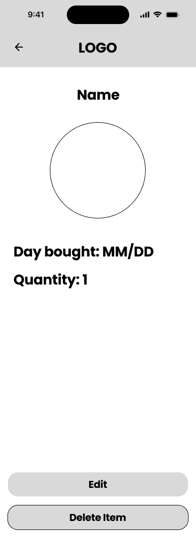
Some needed a more thorough item page such as including expiration dates when adding groceries to their pantry
One suggested options to share recipes to other potential new users of the app
Another talked about including the full recipe of the selected dish before going through the steps individually to make it transparent to users the difficulty level
💡 PROTOTYPE
Style Guide
I wanted to create a consistent and cohesive style for fresh to make users feel welcomed and supported through this new experience of living alone and independence during college.
Typography:
Poppins is a geometric sans-serif typeface that is suitable for headings and body text to improve readability. This clean and simplistic typeface shows creativity and modernity.
Colors:
I decided to use green as the primary color allowing users to feel new, growth, and fresh.
Iconography:
I chose to use Lucide for fresh's icons for a clean and friendly look that is created with their rounded edges and simplistic design.
Buttons:
To make the buttons clickable and easy to read, I followed these guidelines:
I made sure the text on the call to action buttons were straightforward.
I ensured the text and background followed color contrast accessibility guidelines.
I gave them a size and padding that is easy for users to click.
I made buttons with a larger corner radius to create a more "friendly" feeling.

Finally, fresh came to life!
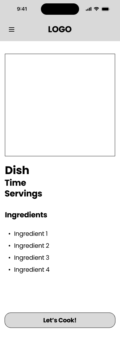
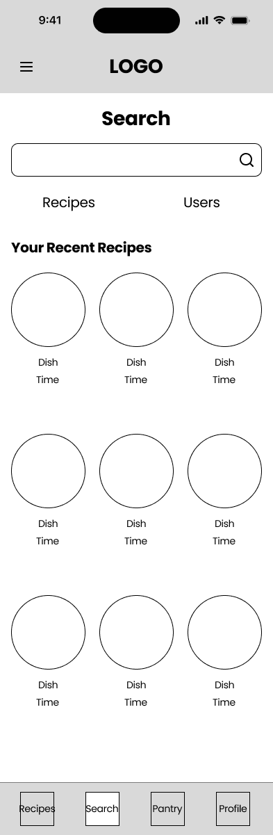
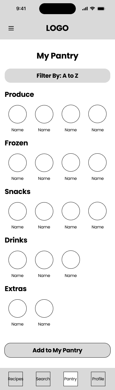
Home page fills up with suggested recipes based on groceries recorded
Students want to learn quick and new recipes to manage their food in their fridges by using and keeping track of what they buy to reduce food waste.
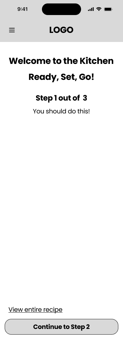
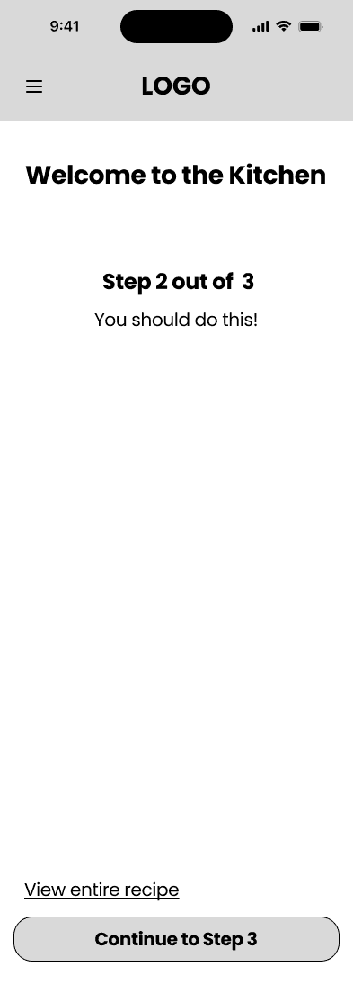
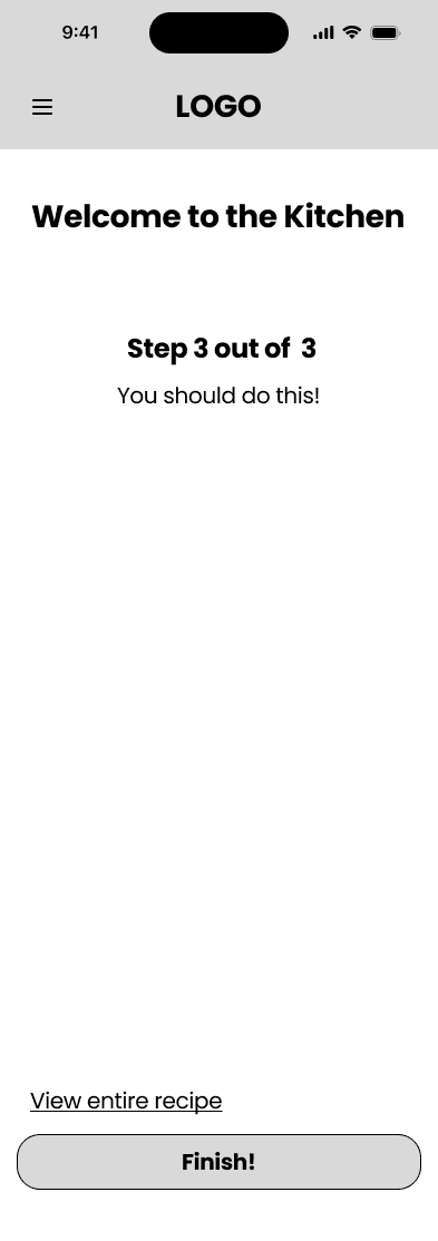
Easy to follow step by step recipe walkthroughs
This guides users through their cooking session with options to proceed to the next step or go back to the previous one. Users can also choose to view the entire recipe instead.
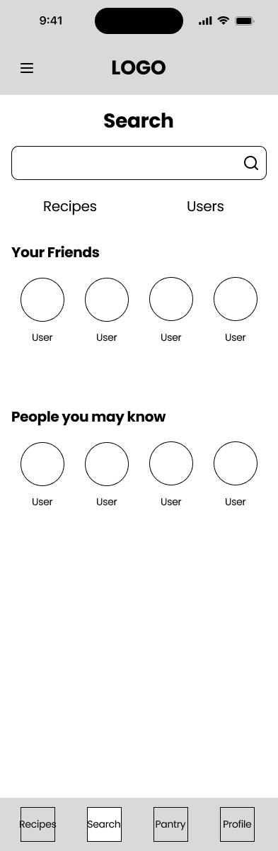
Users can quickly add or edit items in the grocery recorder, all in one place
Users see all of their recorded items, separated by sections with filtering options.
Want to browse more of fresh?
View the Figma file and feel free to look around! ✨
💡 REFLECTION
Lessons and key takeaways
User testing & continuously gathering feedback is important
When I first designed my lo-fi prototype, I thought I implemented all of the features I wanted to have on the product, but after just conducting a few user testings, I discovered that there were a lot of usability and accessibility issues. You need another perspective on your product. It is important to make sure your user can navigate through the product on their own. The more testing, the better the product!
Next steps for fresh
🌟 Introduce a feature where users can create groceries lists for an all-in-one food and recipe application
🌟 Implement another additional feature where users can upload their personal recipes for others to discover and learn
View more of my work!


